I decided to use my Christmas break productively this year. Don’t get me wrong; I still had my fair share of sleep-ins and lazy days, enjoying the company of my brand new puppy, Freddie (see adorable photo above!). But, these relaxing, battery-recharging days were interspersed with Wordly odd jobs that have lingered on the to-do list for quite some time.
By far, the largest of the tasks I set myself was the design of a brand new website for Wordly. My old site was over 18 months old, and while it was still dutifully serving its intended purpose quite well, I was ready for a fresh, revitalised site. Over the last 12 months or so, I have been honing my WordPress skills, and (while I am by no means an expert), I had enough skills to muddle through and create my brand new website.
While I was busily planning my new site and sifting through libraries of WordPress themes, I did a wee bit of research on cutting-edge web design. So, I thought I’d share some of the recurring of web design trends for 2015 that I came across.
Mobile Optimisation
Without a doubt, the number one web design trend for 2015 is mobile responsive design. If your website isn’t mobile responsive, then it almost isn’t even worth bothering. This year, mobile searches are set to outstrip the number of internet searches performed on desktop computers…for the first time ever. More people are using mobiles and tablets than desktop computers. So, make sure your website renders properly on these devices. That doesn’t mean simply squashing the same design into a smaller space (so that your users can’t read the copy without enlarging the picture). It means a slightly different design altogether, a design built specifically for mobile. When it comes to WordPress, all the reputable theme developers offer mobile responsive versions these days. This was certainly the case with my new site.
Full Screen Image and Videos
People are falling in love with websites that feature almost over-sized, full screen images and videos. It’s no wonder really; it’s more impressive, and always more engaging. As the old saying goes, a picture can tell a thousand words. When it comes to web design, large images quickly and effectively communicate the personality of a brand. And, with advances in technology, browsers and bandwidth, big images are easily handled and quickly rendered on most sites (provided that they are properly set up). This is one of the main reasons that I opted for the large images at the top of the new homepage on my website.
Scrolling Sites
With the increased use of mobile devices, people are becoming more and more used to scrolling and scrolling and scrolling. Gone are the days of the ‘above the fold’ mantra. While the real estate ‘above the fold’ is obviously still important (it is, after all, the very first thing your website visitors will see), it is not the be-all-and-end-all, as it once was.
More Focus on Typography
Traditionally, typography on websites was always quite expensive. So, there really weren’t too many website around that relied heavily on typography as part of their design. This is no longer the case, as this web design trend for 2015 will testify. Unique, beautiful type faces are becoming more common place, and much more affordable, particularly with tools like Google Fonts. This is giving web designers more freedom of design, and allowing a heavier emphasis on typography, and is already being reflected in a number of well-designed WordPress themes.
Flat Design
Over the last year couple of years, we’ve seen the rise of flat design. This looks set to continue in 2015, and may even morph into what Google has dubbed ‘Material Design’. I hadn’t heard of Material Design before, so I did a little digging. Google launched Material Design in 2014, as the new direction for their mobile design (and their design in general). According to Google, “a material metaphor is the unifying theory of rationalized space and a system of motion. Our material is grounded in tactile reality, inspired by our study of paper and ink, yet open to imagination and magic.” Little bit airy-fairy for you? Me too. In reality, Material Design is a flat design style that relies heavily on layering, animation and gradients. Just in case it’s still not entirely clear, here’s what Material Design looks like:
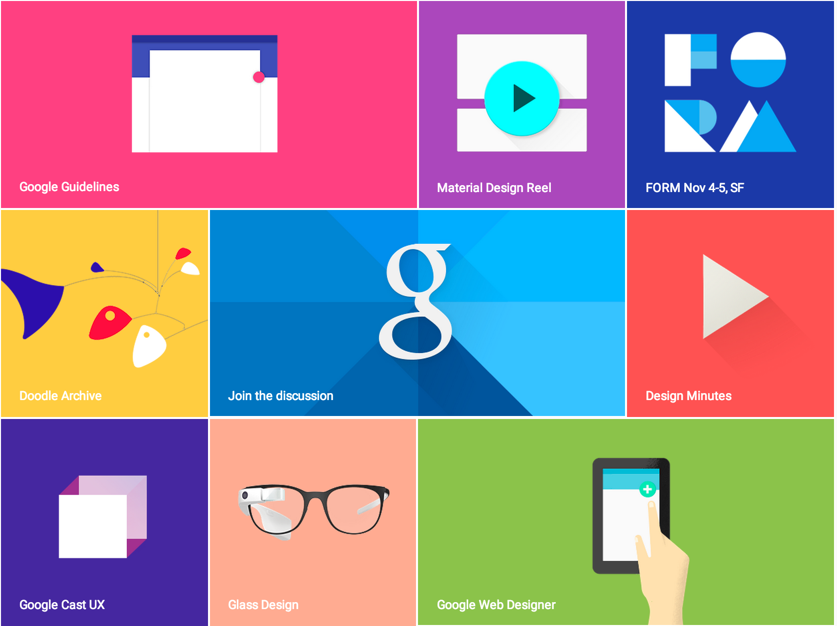
Image: http://www.google.com/design/
Performance Optimsation
The last web trend for 2015 that I came across was performance optimisation. While not strictly related to web design, performance is more important than ever. This year will see developers focus on making websites render faster and perform much more efficiently. These days, website visitors do not hang around on slow, poor performing websites. Your site must load immediately, or they’ll bounce onto the next site in the blink of an eye.
